Leasing Analytics

Enterprise
Peek.us
2024
Peek.us, 2024
Role
Product Manager
Lead Designer
Lead/Sole Designer
Type
Desktop
Dashboard

Web app - Mobile
Background
Led product strategy and design that turned raw leasing data into scannable metrics for three user groups.
Problem

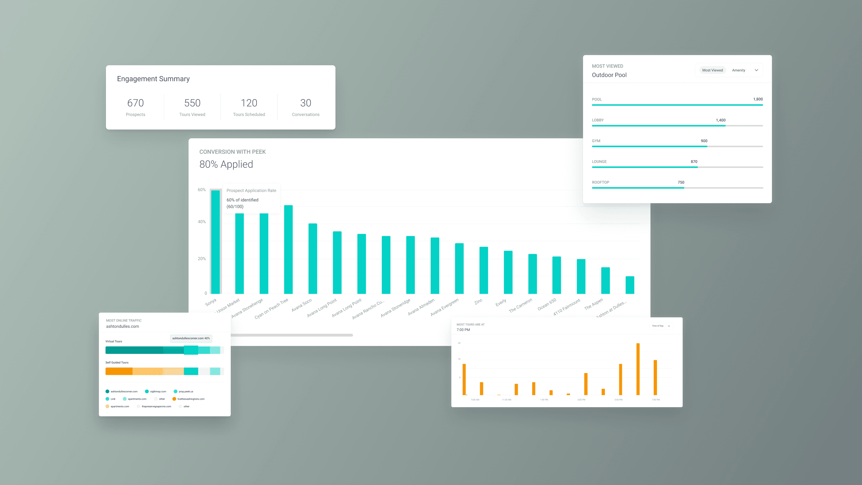
Property managers measured success through application rates and vacancy days. Our dashboard measured views and engagement time. The gap was both data and design: we were missing the metrics customers needed most, and burying the ones we had in a flat page with no hierarchy for different user roles. Customer interviews surfaced three missing data points (application rate, leasing velocity, CTA engagement) and the IA failures that made even existing data hard to act on.

The Gap

28 interviews across three customer organizations revealed four compounding problems: (1) metrics didn’t map to how they evaluate leasing effectiveness, (2) CSV exports only included views, (3) no way to compare across product plans, and (4) three user roles scanned the same page with different questions but the layout gave every metric equal weight. No hierarchy, no sectioning.

2 Phases

The top 3 requested metrics needed 3 to 4 weeks of new backend pipelines. Phase 1 shipped value from existing data: reusable chart components, a CSV export modal with selectable data points and date ranges + community filters. Phase 2 reorganized the pages into three sections mapped to user mental models: Conversion, Engagement, and Content Creation.

Research
Persona-to-metric mapping
  • Portfolio Leadership: Need portfolio-wide comparison.


  • Marketing Managers: Need drill-down and funnel filtering with portfolio-to-unit navigation and prospect segmentation.


  • Onsite Teams: Need at-a-glance status, not charts.

Research
Persona-to-metric mapping
  • Portfolio Leadership: Need portfolio-wide comparison.


  • Marketing Managers: Need drill-down and funnel filtering with portfolio-to-unit navigation and prospect segmentation.


  • Onsite Teams: Need at-a-glance status, not charts.

Audit
Scoping the product, structuring the design
  • 12 data points mapped by priority, availability, and which user question they answer.


  • 3 high-priority metrics required new pipelines, creating the phasing strategy


  • 3 lower-priority items were cut to keep scope and IA manageable

Audit
Scoping the product, structuring the design
  • 12 data points mapped by priority, availability, and which user question they answer.


  • 3 high-priority metrics required new pipelines, creating the phasing strategy


  • 3 lower-priority items were cut to keep scope and IA manageable

Constraints
Product constraints that became design constraints
  • Data literacy gap: If the insight isn’t readable in 5 seconds, the chart failed


  • Backend bottleneck: 3 to 4 weeks for new pipelines.


  • Variable product mix: Adaptive components expand based on available data

Constraints
Product constraints that became design constraints
  • Data literacy gap: If the insight isn’t readable in 5 seconds, the chart failed


  • Backend bottleneck: 3 to 4 weeks for new pipelines.


  • Variable product mix: Adaptive components expand based on available data

Execution
The Approach

28 interviews (7 product + 21 sales) across 3 orgs

Data audit: 12 metrics scored by priority + availability

Chart types matched to data shape + user skill level

Component architecture that scales across phases

FE spec, GTM positioning, and sales enablement

Mapped 3 personas to metrics and scanning patterns

3 missing data points that reframed project scope

IA: Conversion / Engagement / Content Creation

Color system (teal/yellow) as cross-component wayfinding

End-to-end: research → IA → design → spec → GTM

Challenges
What wasn’t in the brief
The audit reframed the design problem

Started as a dashboard reorg. The audit revealed the top 3 metrics didn’t exist, reframing this from a UI refresh into a data pipeline initiative with a design layer on top.

->

Components had to work with partial data in Phase 1 and scale when new metrics arrived in Phase 2. No “coming soon” placeholders. Each phase had to feel complete.

Shipping without the top 3 requests

Application rate, leasing velocity, and CTA engagement were the three most-requested metrics, and none shipped in Phase 1. Backend needed 3 to 4 weeks, a hard dependency that could block everything.

->

Phase 1 shipped value from existing data instead. The IA ensured Engagement and Content Creation stood alone, and Conversion slotted in later without rearranging what users already knew.

One page, three mental models

Merging VT and SGT into one view reduced context-switching but created comparison problems the separate pages never had. Metrics across products don’t have 1:1 equivalents.

->

A persistent color system (teal = VT, yellow = SGT) solved attribution across every chart and KPI card. The three-section IA meant each user group lands in their section first.

Final Designs
The Feature
Dynamic
View the most relevant data

View aggregate data of an entire portfolio or filter down to specific properties.

Compare properties with different plan enrollments to evaluate product performance across VT and SGT.

Track applicant behavior and compare it to prospects or leads who didn’t apply.

Organized
Addressing different user needs

Users switch between analytics sections, each designed for different roles and metrics.

Operations teams focus on content management, marketing teams on engagement, and organization managers on conversion.

Color-coded product attribution persists across every chart so users always know which product they’re reading.

From data dump to reporting tool
CSV export for quarterly reviews

The old export was a single CSV of view counts. The redesign: a modal with configurable date range, community filters that mirror the page, and 7 report templates mapped to how teams do quarterly reviews. Dashboard filters carry over automatically so downloads match what’s on screen.

The old export was a single CSV of view counts. The redesign: a modal with configurable date range, community filters that mirror the page, and 7 report templates mapped to how teams do quarterly reviews. Dashboard filters carry over automatically so downloads match what’s on screen.

Impact
Success Metrics
15x faster data retrieval

Page load and CSV downloads improved up to 15x through query optimization, lazy-loaded charts, and paginated data fetching. Speed was the prerequisite for every other design decision to have impact.

3x reduction in data support tickets

The 7-template export modal with configurable date ranges turned the most-requested data into self-serve. Downloads match what’s on screen and eliminated the disconnect that drove custom data pull tickets.

A Product Differentiator

Application rate and leasing velocity gave sales proof that Peek drives outcomes, not just views. The three-section IA meant sales could demo to leadership and marketing in the same call.

Darlene Tjahjo

Portfolio Site

Copyright © 2024

All rights reserved

Darlene Tjahjo

Portfolio Site

Copyright © 2024

All rights reserved

Darlene Tjahjo

Portfolio Site

Copyright © 2024

All rights reserved